Friday, December 18, 2015

Giuseppe Penone

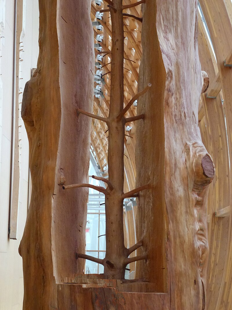
Giuseppe Penone is an outstanding artist who produces fantastic works of art that are absolutely out there. Penone's work is meant to help man connect better with nature. In the piece pictured below Penone took a tree and carved out the middle of it. Inside it sculpted a smaller tree. But this small tree on the inside actually shows what the tree would have looked like at a younger age. Penone is able to follow the growth rings and branches that are present inside of all trees. By doing this he is able to carve out an accurate representation of the tree in its early life.

While many artist create incredible things out of wood Penone is a class above the rest. The time and dedication it took to create this one piece alone is mind boggling. The piece is entitled The Hidden Life Within also shows the journey that a tree takes to reach its final form. Penone's other works also revolve around trees. In one installation he completely hollows out a tree and leaves only the outer bark. Penone's work is both inspiring and breathtaking, and it is safe to say that he has created a style that is all his own.

Monday, December 14, 2015

High Tech Opera

The video links for the MET opera were really interesting. The main feature of an Opera is generally the music, but for the three videos this was not the case. Instead the stage was the main feature of these operas. The stage consisted of 24 panels that were hydraulically controlled and the whole apparatus weighed 90,000 pounds. These hydraulically controlled panels are a great feat of technology and allow the director and producers of the play to absolutely transform the stage 

The panels are used in several ways in the videos, but from these examples it is easy to see that they have the potential to be used numerous other purposes. My favorite scene with the panels has to be The Ride of The Valkyries. In the scene the actors ride the panels like they are the mythological bird, this effect is achieved by having the panels move up and down very similarly to a bird's flight. Although the panels are large blocks the effect is not lost on the audience. Another interesting effect is created when the panels are combined with projections. When these two elements are combined they produce a beautifully abstract set or background for the actors to work with. These panels are an extremely interesting addition to the opera. They open the door for possibilities like a moving stage that flows with the characters or a destructible environment on stage. The applications of this technology are limitless and I look forward to seeing future uses of it.

Sunday, December 13, 2015

Rome's Greatest Amphitheater

When I saw the link for the Roman Colosseum I had to click on it. I visited Rome before and got a chance to see the Colosseum in person and it was a breathtaking experience. The Roman Colosseum is one of the most iconic buildings in history and has been standing since A.D. 80. The Colosseum was a massive undertaking it took a decade to complete and materials were shipped from all around the world to complete. It featured state of the art amenities that no other Colosseum offered at the time. Marble covered seats, 80 arches on each level, a box for the emperor, and a 15 foot tall wall to enclose the arena floor. In addition to these amenities the Colosseum had retractable awning above the seating areas to shelter the crowd from sun and rain. There is also evidence of working drinking and latrines.
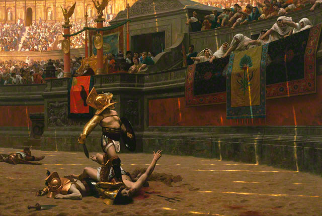
Pollice Verso - Jean Leon Gerome

Underneath the Colosseum floor was a labyrinth of rooms for fighters, supplies, and animals. The Colosseum was ahead of its time by years. Up until recently it was rumored that the Colosseum floor was flooded for naval battles. This was confirmed when archaeologists discovered evidence of aqueducts running into a mechanism that could theoretically flood the floors of the arena. They would later discover evidence of water lines around the arena walls. So much is still unknown about the technology the Colosseum contained. One things for sure the Romans were well ahead of their time and if the empire hadn't collapsed the world would be a very different place today.

Blade Runner

In class we watch the movie Blade Runner directed by Ridley Scott. The movie starred Harrison Ford, Rutger Hauer,and Sean Young. The movie came out in 1982 and used state of the art special effects at the time of its release. Looking back at the movie it is definitely not as impressive as today's CGI masterpieces like Transformers and Avatar. Nonetheless the movie is still compelling and has a complex plot that draws the viewer into the story.

The film is set in 2019, and in that year humans have developed the technology to make androids that are extremely realistic, in the film they are called replicants. The storyline is centered around a police officer named Rick Deckard. Deckard's job is to find and eliminate replicants who have strayed from their purposes. The city that the movie is set is a large sprawling metropolis complete with flying cars and your typical future sci fi setting. Unless we make some serious progress in the next four years I don't forsee any of our major cities looking like the one in the film. Aside from the inaccurate predictions about future cities the movie makes the viewer think about the value of human life. It also brings into to question what it means to be human. It made me wonder about what parameters make a human human, after all we are only a decade or two away from advanced artificial intelligence. Dont believe watch Watson the supercomputer built by IBM on Jeopardy. Overall I found the move to be  thought provoking and entertaining. What did you think?

Art Show #2

As I said in previous post several pieces at the art show caught my attention. The next piece that really stuck with me was also minimalist in nature. The part of the piece that really pulled me in was the message behind the piece. The artist was able to say so much but was able to do so with only eight words and two pieces of paper. The piece is by Samantha Burns and is titled Try
The cut and impressed words contrast each other in a really interesting way and speak on the concepts of trying to remember and trying to forget. The way the artist made the "I CAN NOT REMEMBER" portion of the piece; lends itself to notion that when you forget something is it cut out of your memory but still hanging on by a thread. Sort of the same way that a word can be on the tip of your tongue but you just can't remember it. The impressed letter that spell "I CAN NOT FORGET" do a great job of conveying the idea of an event being burned into your memory. In this case the words are pressed and the paper represents a person's memory. This was by far my favorite piece at the show and I feel that it deserves much more exposure. 

Art Show Intro

Art Shows are always a great experience and the gallery at UT provides an excellent forum for students to display their art. I really enjoyed the art show, the pieces varied greatly in terms of the medium used for each and all of the pieces were really wonderful. Several in particular caught my eye. The first was a 3-d printed penguin by Dylan Berry, the piece is titled Your Baby Penguin. The first thing that drew me to the piece was the colors, then I was more intrigued by the shapes and the geometric nature of the piece. It is very simplistic in nature but the viewer can instantly identify that it is a penguin. Only when I looked closer at the penguin did I realize it was 3-d printed, this part really got me interested. I had worked with 3-D printers but had never seen them being applied for artistic purposes. 

Thursday, December 10, 2015

PBS Timeline

The PBS timeline on technology was really interesting it did an excellent job of showing the progression of technology overtime. It goes from 1750 to 1990 and covers all the major technological advancements that happened in that period. What really captured my interest was the small little blurbs that popped up when you click on the event. It was really interesting to see the explosions of innovation after the year 1800. Technological advancements took off at an unprecedented rate. In 60 years mankind went from the first airplane to landing a man on the moon. That's absolutely mind blowing, frozen food wasn't invented until 1920.

What drove this sudden explosion in innovation? How come we didn't see technological progress like this earlier in history? The timeline is a great a thought provoking tool and could be really used to generate excellent class discussion on the topic of technology and its influence on society.

Photographic Speed

Photography is a staple of the modern world and we can't go anywhere without seeing a picture these days. But not so long ago it was a much different story advertisements and fliers were all hand drawn or painted. It wasn't until very recently that camera technology started making actual strides. The first photographs required subjects to sit for long periods of time because the technology used required a longer exposure rate. This meant that people most likely didn't smile as it was hard to hold a pose for a long time and the photos were low quality. Fast forward to modern day now everyone has a state of the art camera on them at all times, the newest samsung comes equipped with a 16 megapixel camera. All a user needs to do now is point and shoot and they have a perfectly good crystal clear photo.
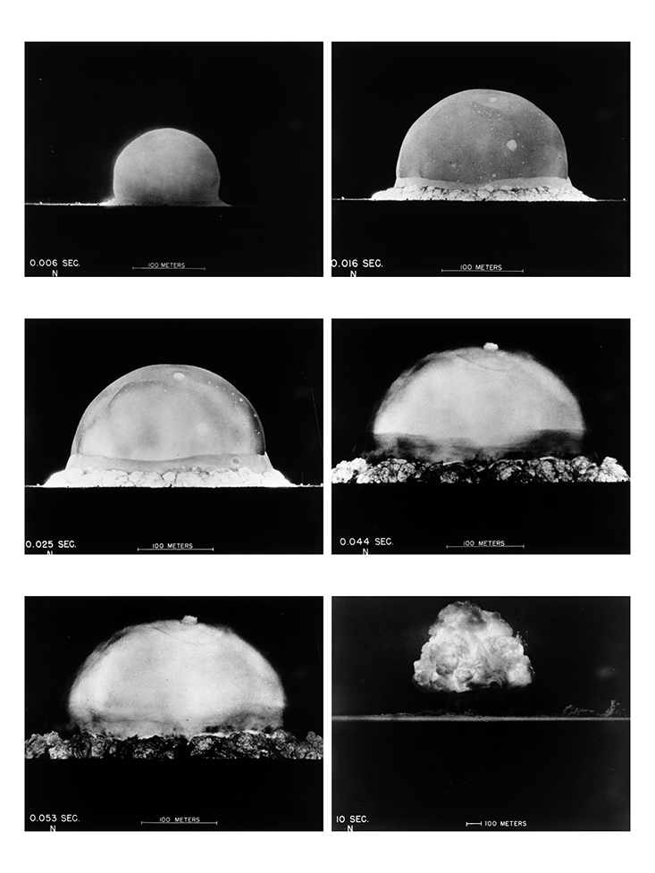
Bang_BREAKER-09
The photo of the nuclear bomb exploding was one of the photos that really caught my attention in the article. It demonstrates the capability of high speed cameras and also reveals something that a viewer would not have seen before. The photo shows the metamorphosis of the explosion, generally when we think nuke we think mushroom cloud but this photo shows something else entirely. It doesn't say this in the article but I remember watching a documentary about high speed recordings of the bombs. The purpose of  the high speed imagery was to help the engineers and physicists who designed the bomb to better understand what happened right after the blast. The high speed photography revealed the actual shape of the blast wave. This allowed the designers to create new models that unfortunately worked more efficiently, but nevertheless high speed photography allowed them to see more than the human eye could.  

Wednesday, December 9, 2015

Art Vs. Design

What is Art? Ah the famous cliche question you see on motivational posters from time to time. But who designed that poster? Is that poster art or is it a design? The article titled art vs. design by Craig A Elimliah analyzes that very question. For me personally it's tough to tell the difference between art and design the two share similar characteristics. The author makes a good point the nature design, he says that design is more fixed and goal oriented while art is more free flowing. I agree with the author on this for me design is something that is intentional and has a pre set ending point already established. While art on the other hand is never truly done and the purpose of art is completely different than design.

When you design something you have an objective in mind, if you want to make a car you select the criteria you want to fill like mpg, size, cargo room, etc. The purpose of designing an object is to make something that has a use or an end purpose. Art on the other hand is just art it does whatever the viewer wants it do. However the lines do get blurred between the two fairly often. We'll go back to the car example after you've selected your criteria you have to decide how the car is going to look. That portion of the process in my opinion is art the style and look of the car is artistic expression of who ever made the first clay model. But here's where things get tricky, if the artist is told to make the car look a certain way because a portion of the market likes sleek smooth cars then the question arises. Is it art or is it a design? Truthfully I can say that I don't know the answer to that question what I do know is that art and design have always gone hand in hand and will always go hand in hand. What do you think?

Emoji Portraits

Emojis are something that I could never see being used as to make a portrait. But then again in every graphic design class ever one of the assignments is to make a portrait using only words or letters so it's not too far off. In my opinion emojis are like modern day hieroglyphics they get a message across in the same space as two letters but can convey so much more. The article about emoji portraits is really interesting to me because the portraits are truly unique and the concept behind them is equally as abstract. One thing that really threw me off was the artist, in the article the artist's name is Yung Jake. Nothing to crazy their considering the fact that he's making emoji portraits, the strange part is that he's a rapper with 12,000 twitter followers. Some of the works are of musicians but the buck stops there when it comes to creating a bridge between his rapping career and art career.
Jerry Seinfeld
The interview in the article was interesting as well, it was mostly emoji based which is no surprise to the reader. However it did offer some insight into the mind of the man behind the portraits. Sadly Yung Jake did not give away all of his trade secrets he declined to comment on how long it takes to make one. He also said that he had done commissioned work but refused to say for whom it was. I am more curious as to how he made the transition from rapping to emoji portraits. I would also like to know why he choose the people he did for the portraits and what motivates him to keep doing this work. With this all this being said I think the portraits are pretty cool and would make for a great conversation piece in a hip upper east side apartment.

P.S. The seinfeld one is cool but a fraiser one would have taken the cake.

Blue Busters

As a marketing major advertisements always catch my attention so I instinctively clicked on the link for the apple advertisement titled Blue Busters. The title was catchy but didn't give away the meaning of the commercial before I saw it. The ad was set to the Ghost Busters theme song and the writers made an excellent parody of it. The ad focuses around the launch of one of the new apple computers and is aimed at IBM which is also known as Blue.

The advertisement is really well and is very playful in nature considering the fact that it is a direct attack on IBM. The advertisement is largely regarded as a hit among consumers and those that work in the industry. I am definitely going to have to agree with the general consensus here the ad is wonderfully done and conveys its message in a unique and fun way. I would however like to see apple remake the ad for today possibly with a different movie like Jurassic Park, Star Wars, or any other 90's movie that's being remade.

A Typical Grid

Grids play a pivotal role in all forms of art in photography natural grids can lead to really interesting photos. In animation grids are used to make sure a piece is being drawn proportionately and aid in the scaling process. Grids also play a role in fonts and serve to keep all the letters within in the same guidelines. With that being said grids are everywhere we look although they may not look like the standard piece of graph paper they are there.

This project required us to make a grid out of atypical objects. I took this assignment in a very literal sense I sought out to find the two most unrelated things in my room and tried to make a grid out of them. What better than half an english muffin and my spartan id card it doesn't get more random than that. Seeing that I had already ate the other half of the english muffin and only had one spartan card I was forced to assemble the grid digitally. I photographed the two next to each other and then photoshopped the image into a grid that consisted of the same image repeating it self. The end product came out much better than I expected. The randomness of the objects draws the eye in and the colors make the image pop. On top of all of this the texture of the english muffin contrasts heavily with the flat and smooth spartan card. Overall this project was enjoyable and without it I would not have learned about the important role grids play in art and other things.  

The Abduction from the Seraglio

Paul Erlic
ART-211
Opera Paper
11/14/15
            Since there was fire there was entertainment, humankind has always sought a distraction from the harsh reality of everyday life. It is widely believed that one of the first forms of entertainment was storytelling, early humans would sit around a fire and exchange stories fiction and nonfiction. Overtime story telling evolved just like all things do, eventually story telling progressed to shows and plays. This long and ever evolving medium of entertainment eventually spawned what is known today as opera. Opera is at its core a drama or a play, what sets opera apart from other shows is that the whole thing is set to music and instruments, the actors are both the characters and the singers.
            Wolfgang Amadeus Mozart was a renowned composer born during the 18th in Salzburg, Austria. Even at a young age Mozart’s talent was unparalleled at age five he performed in front of royalty, he is considered to be a very influential composer during the classical era. Mozart was a musical prodigy so logically he and an interest in opera and it is to no surprise that his operas were highly regarded and celebrated by many. Mozart wrote many operas but one stands amongst the rest Die Entführung aus dem Serail (The Abduction from the Seraglio).
            The Abduction from the Seraglio is broken up into three acts and is classified as a “singspiel “or sing play. The plot or “libretto” is by Christopher Friedrich Bretzner and includes input from Gottlieb Stephanie. The Opera is set in Turkey during the 1700’s and focuses around a man named Pasha Selim who is simply known as Pasha. Pasha purchases three Europeans from pirates and brings them to his seaside manor. He buys Constanze, who is a Spanish woman from a prominent family. He also buys Constanze’s servant who is of English descent and is referred to as Blonde. Lastly he buys Pedrillo who is the servant of Constanze’s fiancé, Constanze’s fiancé is named Belmonte. Belmonte is madly in love with Constanze and is willing to go to the ends of the earth to get her back. Being the faithful fiancé Belmonte tracks his fiancé and servants to Pasha’s residence. Upon his arrival he discovers that his fiancé has caught the eye of Pasha, and that his servant Pedrillo is now the Gardner[. Constanze’s maid, Blonde has been given to Osmin who is Pasha’s overseer. Belmonte runs into Osmin first and while trying to obtain information about his fiancé mentions Pedrillos name. Osmin feels threatened by Pedrillo because he views him as competition for Blonde. Osmin proceeds to insult Belmonte who leaves in disgust, Pedrillo enters and is berated and threatened with death and torture by Osmin. Shortly after Belmonte returns and finds Pedrillo, Pedrillo tells him that the Pasha loves Constanze and is trying to court her, however she cannot forget her former love. Together Pedrillo and Belmonte make an escape plan for all four of them, the only obstacle is Osmin. Pedrillo manages to introduce Belmonte to the Pasha and passes him off as an up and coming architect. Pasha is pleased to meet him and agrees to meet Belmont again the next day. The next day Belmonte and Pedrillo arrive at the palace and attempt to enter, Osmin attempts to bar the entrance but is quickly confused by the two and allows them entry.
            Act II begins in a garden with Blonde repelling Osmin’s advances and threatens to harm him. Osmin leaves and Constanze enters, Pasha enters and again asks her to marry him Constanze refuses and insists that she would rather die. After they leave Blonde and Pedrillo discuss the escape plan of getting Osmin drunk and taking Belmonte’s ship to safety. Pedrillo succeeds in getting Osmin drunk and allows for all four lovers to reunite.
            Act III starts off with Pedrillo setting up a ladder under the ladies window and sings a song to signal the escape. Osmin is woken by the song and in his drunken state takes all four of them to a very angry Pasha. Belmonte is forced to plead for his life and explains that his father  is the Governor of Oran and will pay a handsome ransom for all of them. Unfortunately Pasha and Belmonte’s father are long standing enemies because Belmonte’s father exiled him from Spain. The Pasha is overjoyed that he has captured his enemies’ son and gives the young couple a moment for their last farewell. When the Pasha returns his attitude is much different and he decides that rather than repay evil with evil he will turn the other cheek. He sets all four of them free and they all praise him for his kindness and sail off into the sunset. 
            The Opera is mainly centered on Belmonte this is made evident to the viewer through the use of several techniques. Firstly Belmonte is in almost every scene, he is dressed in a different fashion than the other characters, and the lights highlight his position in the scenes. The attitude of the play is intended to be upbeat but at its heart is similar to a modern day romantic comedy. Firstly the colors of the stage on the costumes keep the mood light cheerful. The songs are playful and poke fun at the different nationalities present in the play. In addition to this there a several cases of dramatic irony throughout the play, this is intended to make the viewers squirm in the chairs as they watch the characters make mistakes. In addition the play being up beat and light hearted there is a happy ending all four of the captured actors get to live and it is presumed that the Pasha and Belmonte’s father make peace.
            Technology always plays a major part in entertainment, movies are always pushing the limits when it comes to video editing technology. The same can be said for operas, theaters are constantly finding new ways to create effects for operas. At the time the equipment used to film this opera was without a doubt bleeding edge technology. In addition to this the equipment used to light the play can also be considered technology. Many lighting systems in large theaters are extensive and require a large number of people to operate them. In addition to this the lights are not ordinary lights and are purpose built for stage lighting. The opera also required technology to make the sets that the play uses without modern power tools it would be a challenge to create an expansive and immersive set for the opera. Computers and printers were also necessary to create the scripts, playbills, and any promotional material for the opera. Even though some view people view opera as an outdated form of entertainment it still requires a great deal of technology to operate. It may not use the same technology as the movie Transformers but sometimes less is more when it comes to telling a story.
            This opera has the classic damsel in distress story line and could be easily translated into a video game today. Mario, The Legend of Zelda, and many other games follow a story that is not dissimilar of this operas. I would translate the opera into a first person rescue game, the user would control Belmonte and his actions. In order to make the game more appealing to consumers I would add enemies for Belmonte to defeat. To keep with the original time frame I would put the game in the same setting and add weapons that would fit the time frame accordingly. The game would also have a stealth portion to it, specifically the part where Pedrillo gets caught setting up the ladder. Instead of the traditional ending where the Pasha spares them; I would set up a sort of “boss fight” where Belmonte defeats the Pasha and spares his life. In return for Belmonte’s restraint the Pasha grants the couples safe passage home and they sail off into the sunset at the end of the game.   

Tuesday, December 8, 2015

Ice Box and Music Video History


Another piece link that caught my eye was the brief history of music videos link. The website the link goes to provides a timeline of the evolution of music videos. It was very fascinating to see that the first music video was made in 1956 by Tony Bennett. Furthermore the site does an excellent job of showing the progression of music videos and how the path they took to shaping our culture today. Both links provided me with insights as to how music videos are made and why they can be so abstract in nature but still retain their message.

Originally I clicked on the ice box link because I thought it would be a music video filmed in one of those ice hotels or an igloo. This was not the case however I was pleasantly surprised by the video. It starts off by showing the viewer a book full of paper cutouts of backgrounds and sets. It looks like a children's pop up book but then the artist does something incredible. The artist lines the book up and projects light and images over the cutout book and suddenly it the once dull paper cut outs come to life. I found this video very fascinating ; I learned that you can use two different types of media to create and convey one message that neither could convey on their own.

Performance Art Video

My performance art video is titled  Tots on the Bluff and loosely draws inspiration from a Netflix "mocumentary" titled Snow on the Bluff. Snow on the Bluff is about a drug dealer in the ghettos of Atlanta who comes across a camera and decides to record his day to day life. The movie is a dramatic piece and feels extremely realistic. My video draws on the first hand sort of filmmaking that was present in Snow on the Bluff and also draws on another music video. The other video is a first person music video by the band Biting Elbows and the song is titled Bad Mother&*#($ (excuse my french). In the video the main character is captured and fights his way away from the enemies all the while chasing a mysterious object that the viewer can assume to be a teleporting device. My goal was to create a cross of these two videos and create something truly unique.

 The entire movie was filmed with a GoPro strapped to my forehead this really expedited the first person shot process and was a major part of the film. My original intention was to create a sort of parody on the Biting Elbows music video where I used tate tots instead of guns to fight my enemies. But as I mulled over the idea more and more I decided that it would interesting to film a social experiment video. Where I would try to sell tater tots around campus in manner similar to that of a drug dealer. I then decided that this would be a bad idea and would most likely result in some sort of undesirable interaction with the police. So I decided to compromise and made a dramatic music video that followed the life of a tater tot dealer in first person. I really enjoyed the process of filming and editing the video and I am extremely pleased with the end results.

Walt Disney Cartoons


I found the How Walt Disney Cartoons are Made video to be very informative. The video shows how how much time, coordination, and effort goes into making children's cartoons. The drawing is done by several different people who can all the draw the characters exactly the same. Each scene requires hundreds of images. Luckily the artists can draw on top of what they drew before because of their backlit tables. Even the coloring of the images was more complex than I originally thought. After the artists draw the initial images they are sent through several steps. First a completely separate department traces the images lines onto a clear piece of plastic with ink. Next another department very carefully colors in the tracings. Even the amount different colors they have in the color department is ridiculous, the video says it's somewhere in the neighborhood of 1500.


The coloring and drawing process alone are lengthy and time consuming by themselves but no Disney cartoon is complete without music. On top of all the drawing Disney writes, produces, and records all of the music for their cartoons. This also means that the music must be coordinated with the storyboard so there is no room for error when it comes to timing. The cartoon creation process is a truly unique and interesting one. This video did an excellent job of explaining the finer intricacies of the cartooning process and served as an excellent learning tool.      

Flip Book

The flip book project was extremely time consuming and tedious but I did enjoy it when I got to see my final product. The flip book really helped to illustrate the process of how a movie is made and all the work that goes into it. It also helped me to understand how difficult stop motion animation and cartoons are to make. Each individual portion of any kind of video is its own frame or drawing if it's animated.

The human mind and eyes register images at around 60 frames per second. That's pretty fast, that also means if you want to make a video that runs at 60 frames a second you need to have 60 frames of footage for everyone second of viewing time. This absolutely blows my mind my flip book ran nowhere near 60 frames per second and took me several hours to make. Thanks to this project I now know I never want to be a professional animator but I'm glad I know how it's done.

People Pixels

You've all seen a marching band do a complex routine at a football game, maybe they spelled out a word or made the shape of a football. One artist is taking the people as pixels concept to a whole new level. American artist Craig Alan is using people to create complex works of art that are absolutely stunning. 
The people really help to show the viewer the actual scale of the pictures and they also help to show how much of an undertaking this actually is. The JFK portrait is my favorite out of the collection, and all the pieces remind me of typography art. What will craig do next, animals as pixels,plants as pixels? I guess we'll just have to wait and see.